Challenge
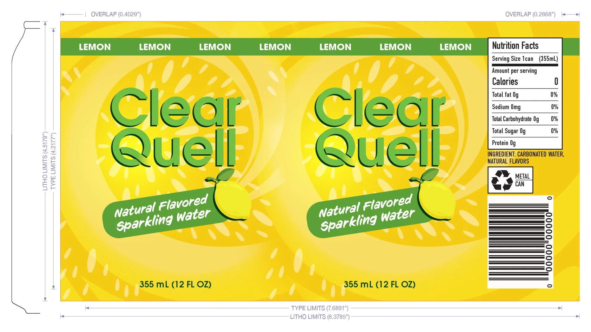
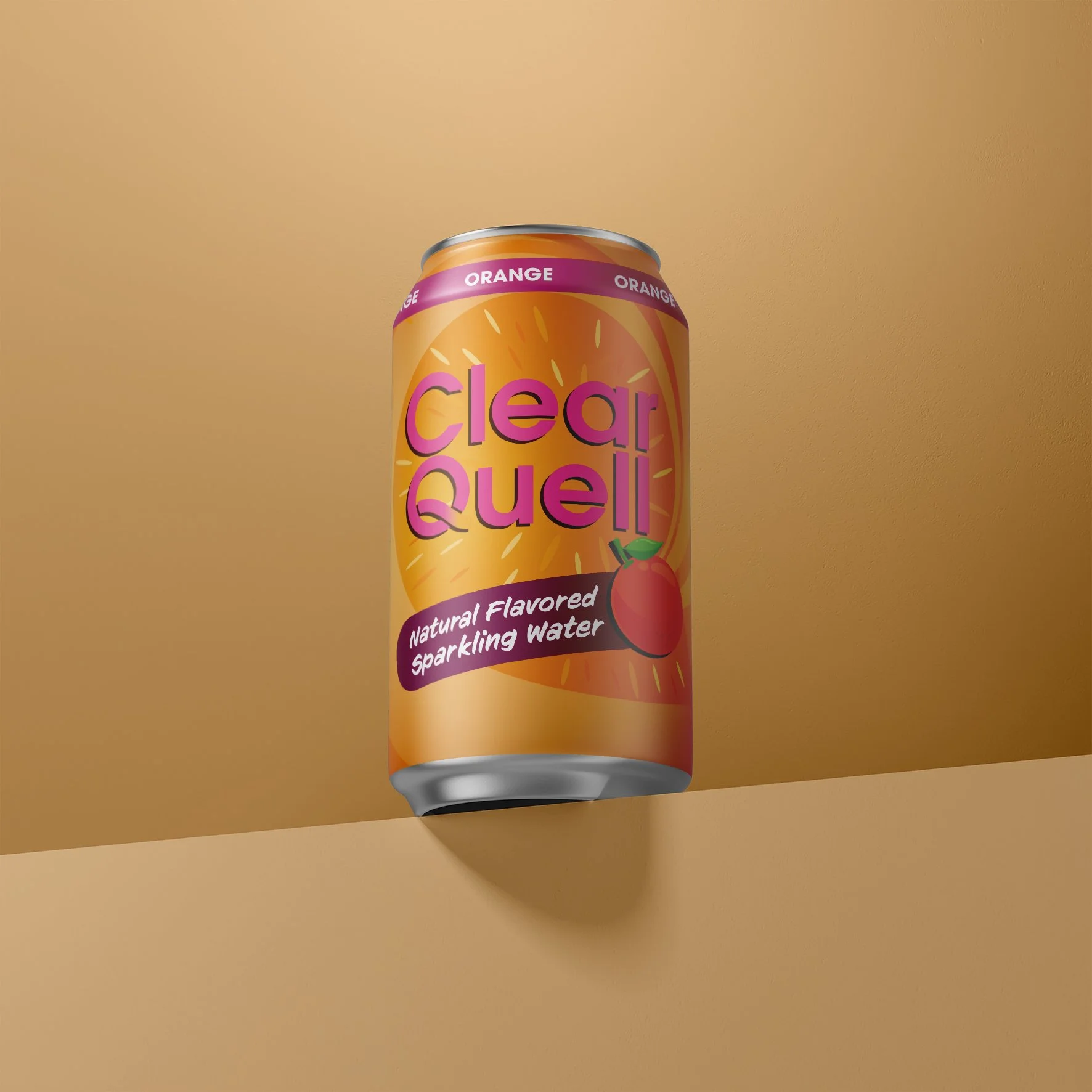
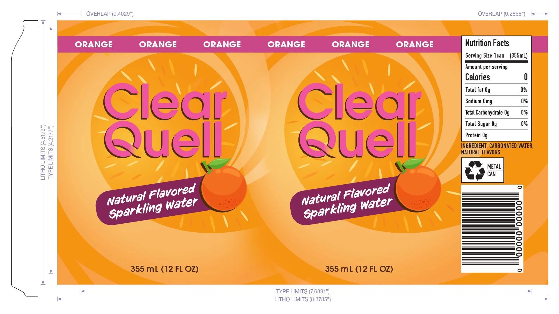
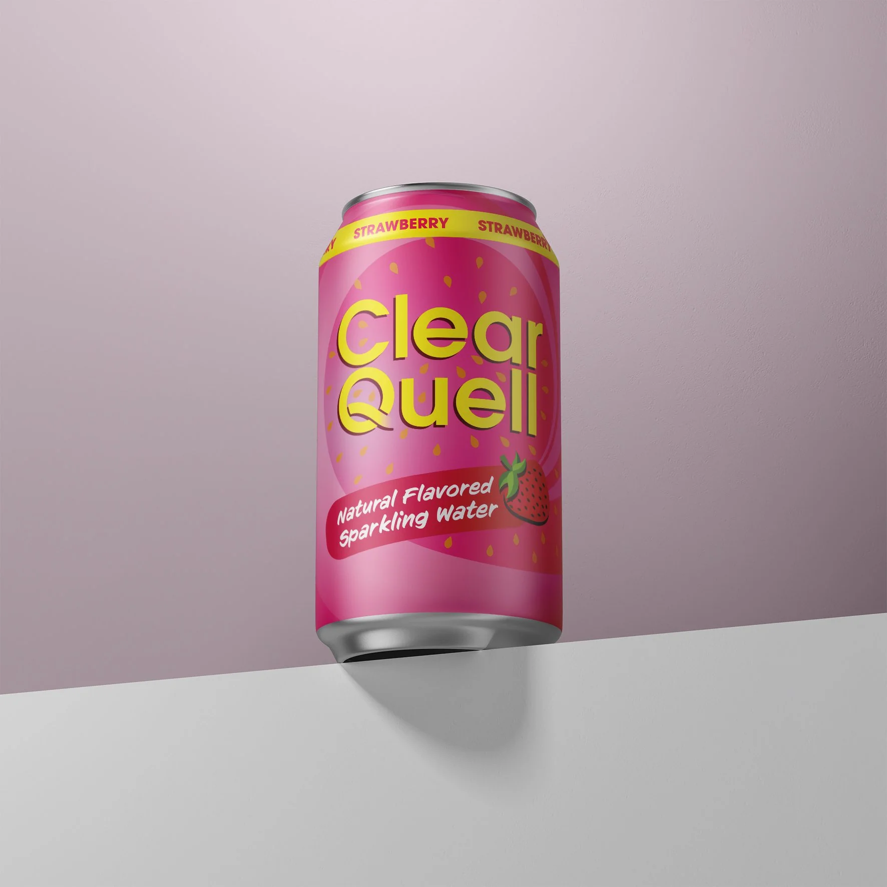
The sparkling water market is highly competitive, with many brands relying on similar visual styles and generic flavor cues. Clear Quell needed a packaging design that would clearly communicate its natural ingredients, differentiate each flavor, and convey a sense of purity and authenticity while maintaining a premium appearance.
Solution
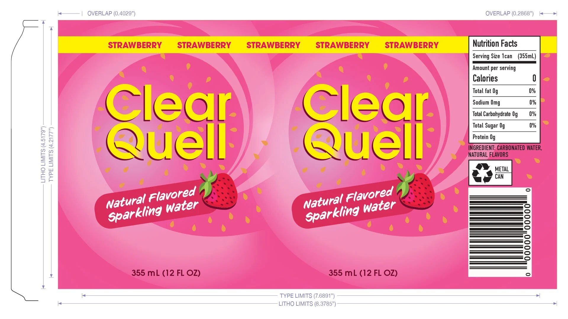
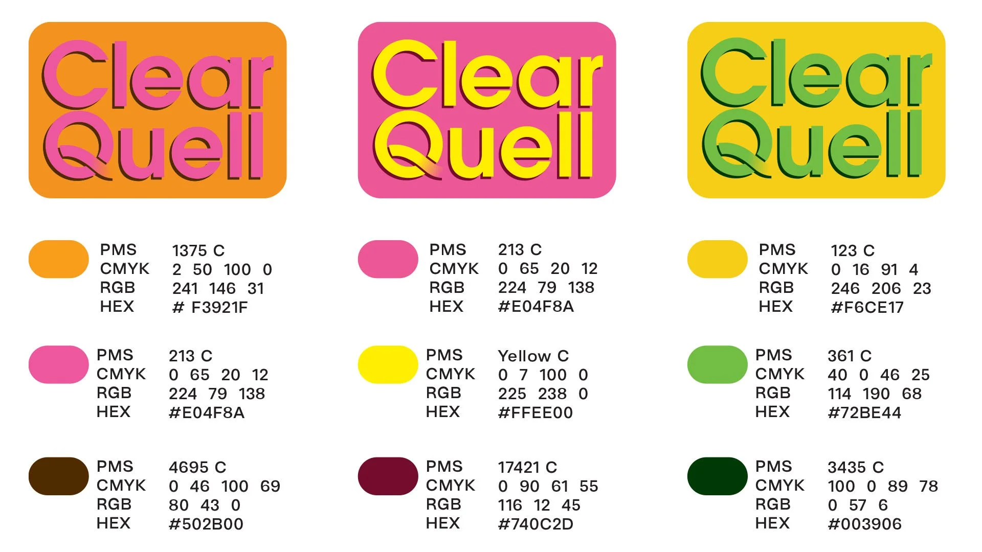
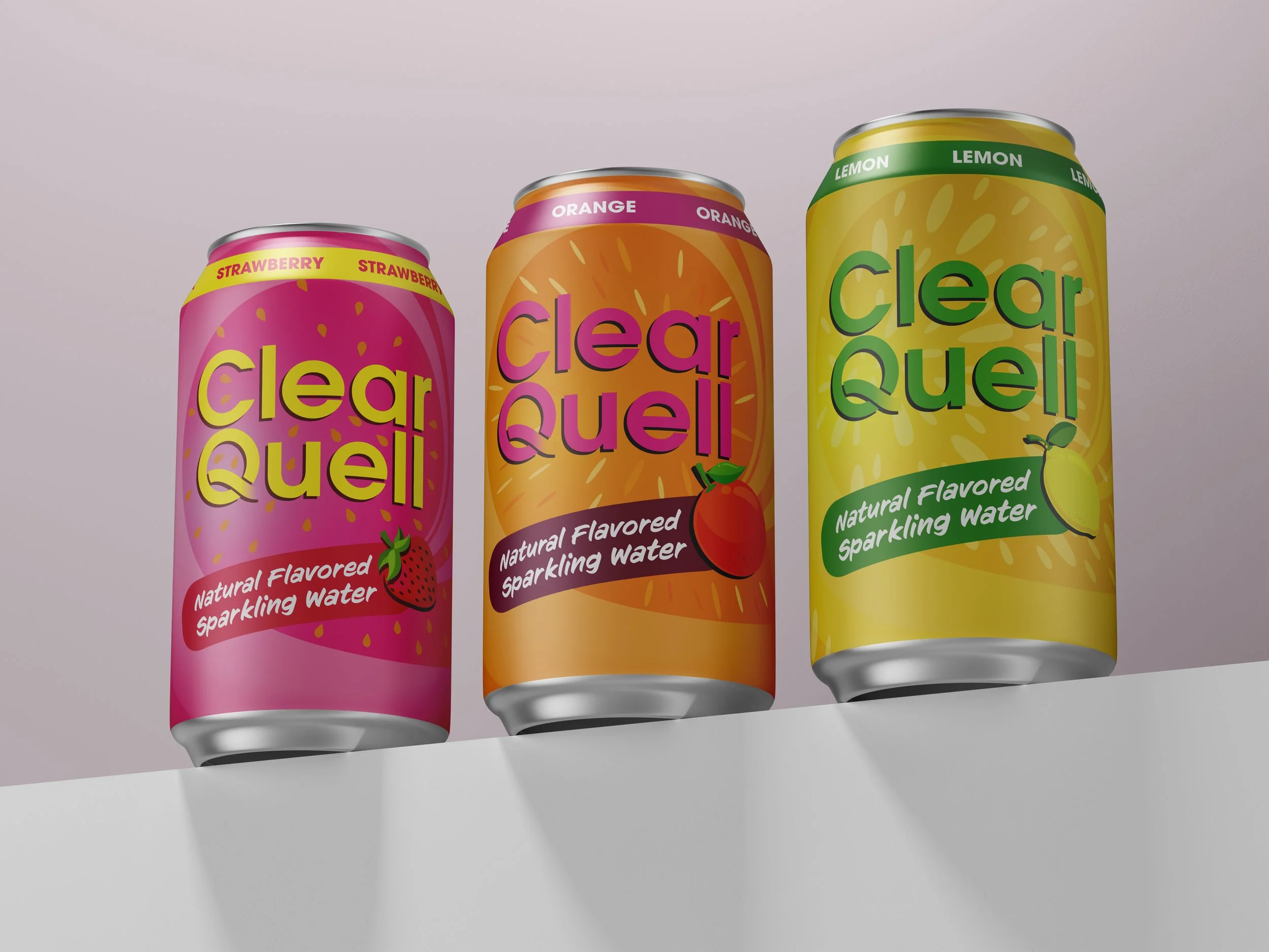
I used the natural textures of real fruits to highlight each flavor and paired them with bright, summer-inspired colors to convey freshness and energy. A clean, minimalist layout reinforces the brand's values of purity, clarity, and authenticity.
Outcome
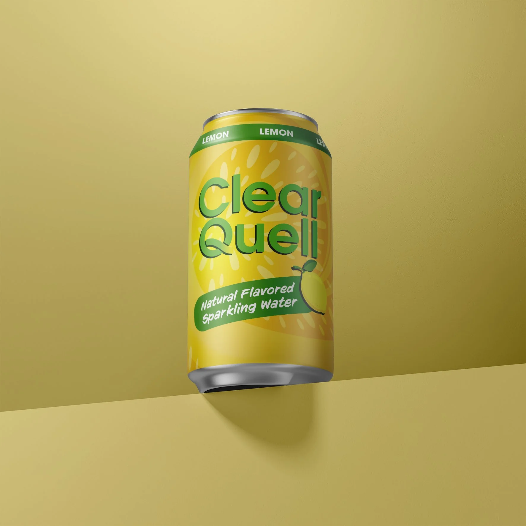
The result is a vibrant and cohesive packaging system that clearly communicates flavor, attracts attention, and strengthens the brand's fresh and natural identity.